“Toys and games are the preludes to serious ideas.” —American designer Charles Eames
Denver Art Museum’s new exhibit, Serious Play! Design in Midcentury America, demonstrates just how much play matters in innovation. The exhibit explores three themes—home, children’s toys, and corporate approaches—showing how incorporating playfulness allowed designers in the ’50s and ’60s to bring fresh ideas to postwar American design.

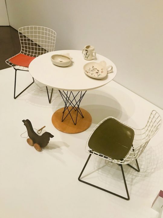
“Play was not adjacent to their process, but essential to it,” says Darrin Alfred, curator of architecture and design at the Denver Art Museum, and co-curator of the exhibit. More than 200 works from 40 designers—including a variety from husband-and-wife team Charles and Ray Eames, well known for their furniture design; Paul Rand, creator of Colorforms and print advertising; Eva Zeisel’s pottery work; and Irving Harper’s clocks—showcase the bright colors and innovative shapes that sharply contrast the muted, traditional designs of the Depression and war eras.
Visitors are encouraged to dig in and play at interactive stations designated with a hand icon. Create your own designs with vinyl Colorforms, spin innovative tops, and build houses of artfully-designed, interlocking cards. “We wanted to focus on building toys from architects and designers—toys that were educational,” Alfred says. (As a child, “Legos were my thing,” Alfred adds.)
The playful midcentury design style took off during the 1950s and ’60s for a number of reasons. This was the Cold War era and anxiety was rising, so people wanted to create positivity in everyday spaces. Diverse manufacturing techniques and materials were more widely available, and a growing middle class with more disposable income meant more possibilities for American homes. And new interest in smart toy design and children’s furniture grew from an emerging focus on child development.
Included in the exhibit are vintage toys that share similarities with some modern STEM toys. Alfred notes that one of his favorite toys that he learned about during research for the exhibit was Flexigons building set. Designed by architect Fred Bassetti, Flexigons used cardboard panels and rubber bands to create three-dimensional structures. A sheet included with the set encouraged children to learn about geometry, and send in photos of their creations. “It could be used to create scenes and all sorts of things in colors like blue and orange and pink, and it feels like a toy that either a boy or a girl would appreciate,” he says.

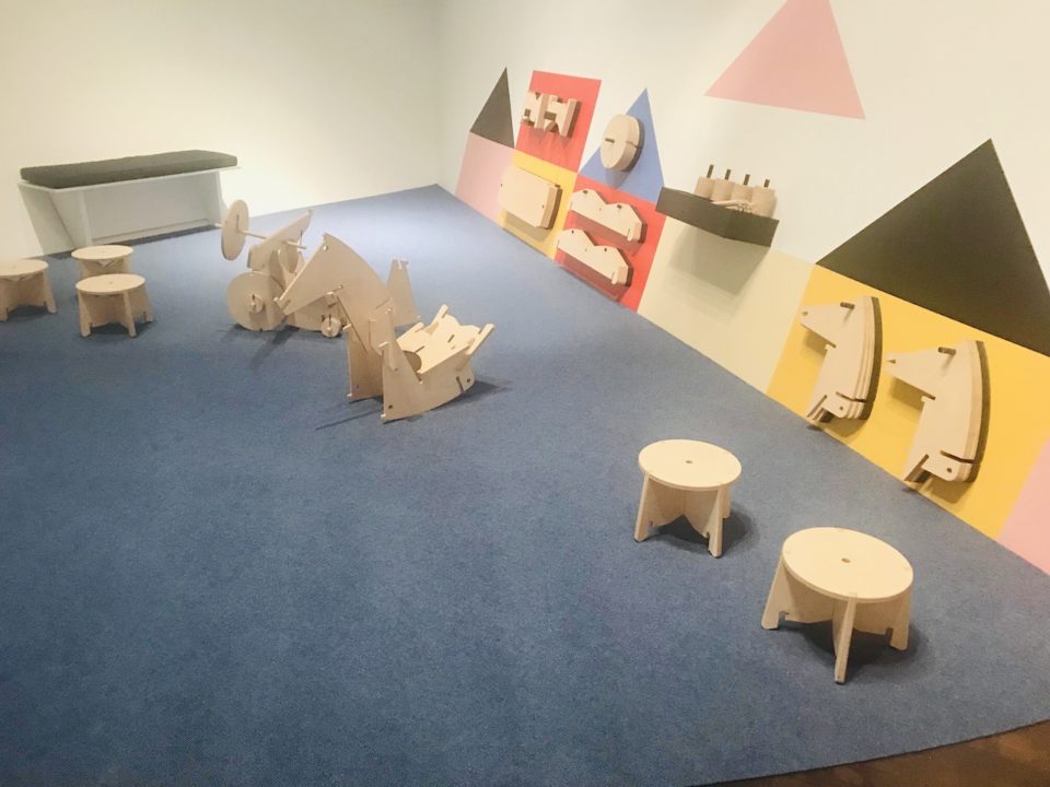
The exhibit culminates in the wide-open Free Play Zone, where kids can use their imagination with some elements of structure. Kids (and their adults) can climb on a giant, flowing play structure inspired by the work of Isamu Noguchi; pretend with a variety of fabric masks and capes in a theater-like setting; and build with the Tyng Toy, a set of large wooden shapes by designer/architect Anne Tyng.
Need to Know: Serious Play! was co-organized by the Denver Art Museum and Milwaukee Art Museum. The exhibit is open May 5 to August 25 in the Hamilton Building. General admission is $8-$13 and free for children under age 18.


